Crafting Atmosphere with Light
The Designer’s Guide to Color Temperature
For lighting designers, light is more than mere illumination—it’s the silent language of a space. It tells us how to feel, where to look, and what to do. And within this language, Correlated Color Temperature (CCT) is one of the most potent, yet often misapplied, dialects.
Choosing the right CCT shouldn’t be a matter of personal preference, nor a one-size-fits-all formula. It is a deliberate design decision that sits at the intersection of psychology, function, and aesthetics. This guide will equip you with a framework for selecting the ideal color temperature to tell the right story for every space.
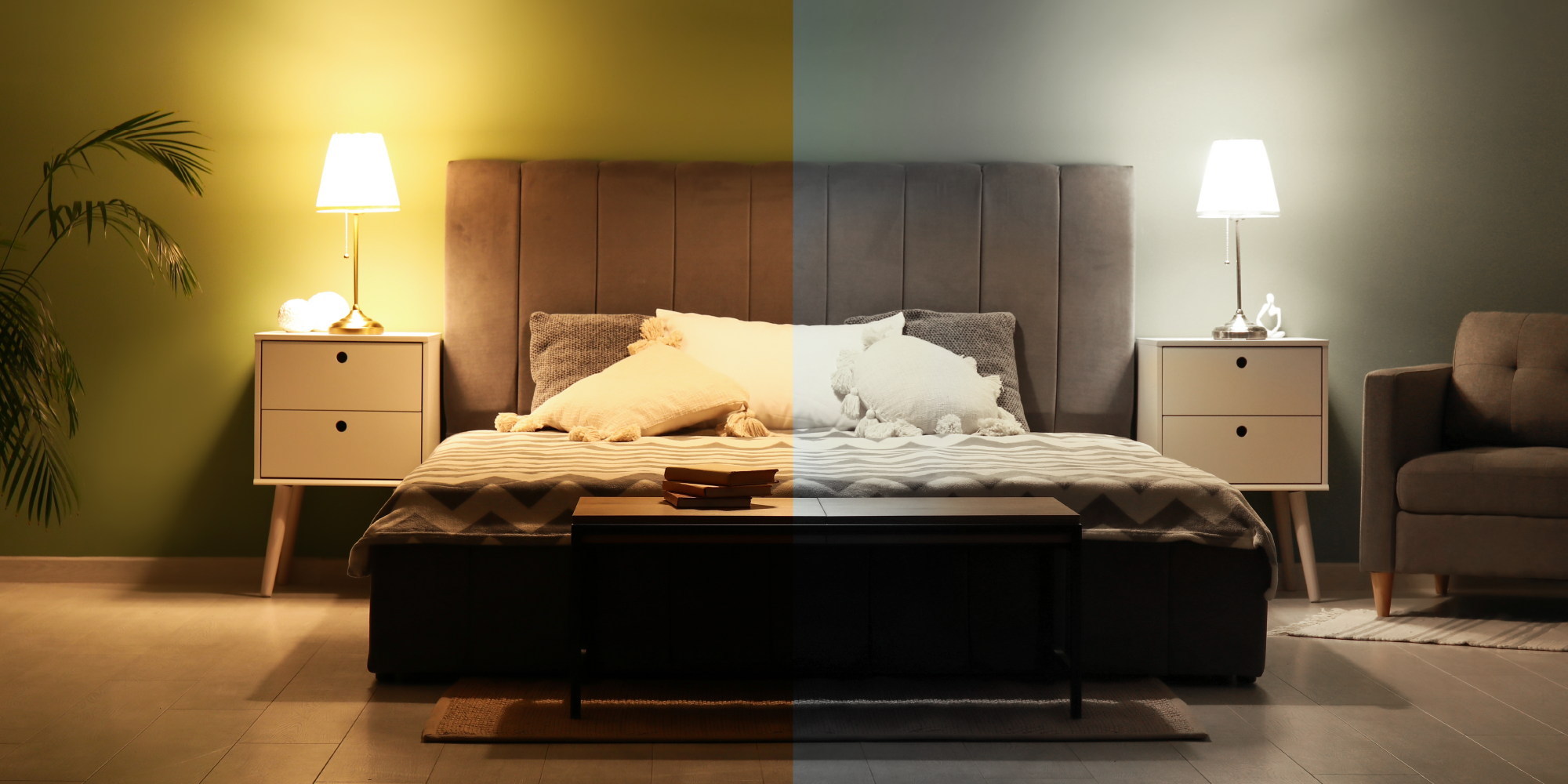
The Foundation – Understanding the Kelvin Scale
First, a quick refresher. Correlated Color Temperature (CCT) is measured in Kelvin(K) and describes the apparent color of a white light source. CCT of white LED light normally could range from 2200K to 6500K.
Soft / Warm White (2200K – 3000K): Mimics the golden, comforting glow of a sunrise, sunset, or incandescent fireplace. It evokes feelings of intimacy, relaxation, and warmth.
Neutral / Cool White (3500K – 4500K): Resembles the crisp, clear light of a bright, overcast day. It feels clean, balanced, and alert, promoting focus without sterility.
Daylight (5000K – 6500K): Echoes the stimulating, blue-rich light of a midday sun. It promotes high visual acuity, energy, and a sense of sterility.
With the vocabulary defined, let’s move to the syntax of application.

The Three Pillars of CCT Selection
Your choice should be guided by a balance of three core considerations – Psychology of Atmosphere, Function of the Space, and Aesthetic & Material Context.
Pillar 1: The Psychology of Atmosphere
Before anything else, ask: How should this space feel?
Use Soft / Warm White (2200K-3000K) to create:
· Intimacy & Welcome: The default for hospitality—hotel lobbies, restaurant dining rooms, and cozy bars. It makes occupants feel comfortable, safe, and inclined to linger.
· Relaxation & Tradition: Ideal for residential living rooms, luxury spas, and heritage buildings. Warm light is inherently flattering to skin tones and rich materials like wood and leather.
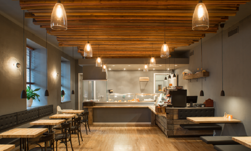
Use Neutral / Cool White (3500K-4500K) to create:
· Clarity & Efficiency: Perfect for task-oriented environments where a neutral, “true” white is beneficial. Think office workstations, kitchen counters, retail floors, and classrooms.
· Balanced Alertness: It provides visual stimulation without the harshness of cooler tones, making it suitable for collaborative spaces and public areas like libraries.
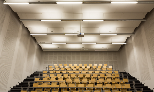
Use Daylight (5000K-6500K) to create:
· High Acuity & Stimulation: Reserved for situations where maximum visual precision and alertness are paramount. This includes hospital operating rooms, art conservation studios, and industrial settings.
· Perception of Sterility: Often used in corridors, warehouses, and big-box retail to convey cleanliness.

Pillar 2: The Function of the Space
The activities performed in a space dictate practical CCT needs.
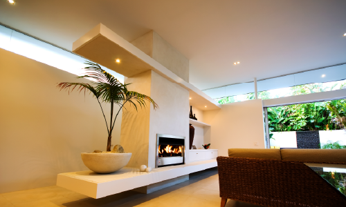
Soft / Warm White (2200K-3000K):
· Suitable for spaces mainly for relaxation and leisure activities
· Residential bedrooms and living rooms: Supports circadian rhythms by minimizing blue light in the evening.
· Use as general ambient light in larger spaces or multi-functional areas. Dinning island in kitchens, open space in hotel lobby or boutique stores.
Neutral / Cool White (3500K-4500K):
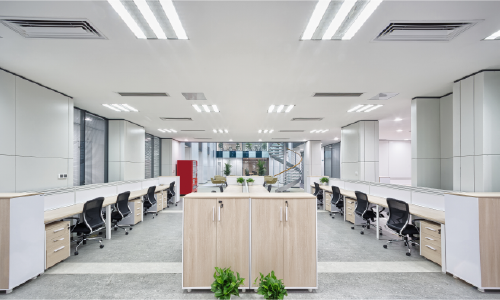
· Default for task-oriented areas and office desktops. Ensure functional clarity for staff to boost efficiency.
· Retail Merchandise, Jewelry / Automotive. Use cooler tones to guide visual focus and make products like diamonds or chrome “sparkle” with contrast against the general warmth ambience.
Daylight (5000K-6500K):
· Necessary in spaces where high level of visibility and clarity is essential – hospital operating rooms, dentist office, factory assembly lines, laboratory settings, etc.
· But use with caution — it can feel cold and uninviting in human-centric spaces for extended periods.

Pillar 3: The Aesthetic & Material Context
Light interacts with every surface. Your CCT choice must complement the existing palette.
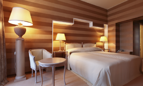
Warm Palettes (Wood, Brass, Earth Tones):
· Warm white light (2700K-3000K) will enhance and enrich these materials, creating a cohesive, harmonious environment.
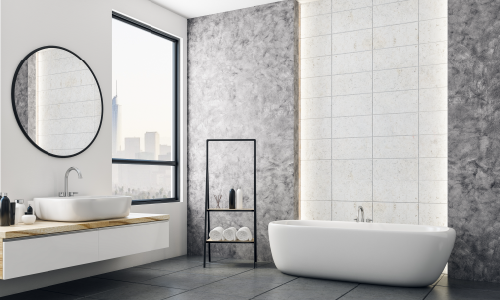
Cool Palettes (Stainless Steel, Glass, Gray, White):
· Neutral to cool white (3500K-4500K) will amplify their crisp, modern, and clean aesthetic.
The Universal Rule: When in doubt, go to the side of warmth. A space that is slightly too warm will generally still feel pleasant and inviting. A space that is slightly too cool will feel sterile, harsh, and unwelcoming.
Advanced Considerations for the Modern Designers
CRI is Your Non-Negotiable Partner
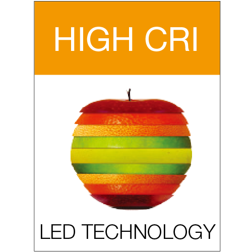
CCT alone cannot complete the mission without a high Color Rendering Index (CRI). A 90+ CRI is essential to ensure the colors you and your client selected are rendered accurately. A 3000K light with a low CRI will make a rich burgundy wall look muddy and dull. In spaces where accuracy of color is paramount like art galleries or museums, consider light sources featured with TRUE CRHOMA technology.
Embrace Circadian Rhythm Design:
We now design for human health. Tunable-white lighting systems allow CCT to dynamically shift throughout the day—energizing cooler light in the morning, neutral at midday, and warm in the evening. This is transformative for healthcare, education, and corporate environments.

Layer and Differentiate
A single CCT per room is a missed opportunity. · Stay away from uniform cool white in workplaces. Use 3500K-4500K in open-plan areas for focus, and 2700K-3000K in breakout rooms to signal a shift to a more relaxed, collaborative mode. In a kitchen, use 2700K in the pendant over the island for ambiance and 4000K under the cabinets for task lighting. This creates depth, interest, and functional clarity.
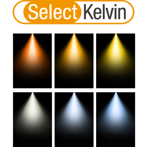
Consider lighting products featured with field selectable CCTs as an option. They could provide the flexibility for space upgrading and atmosphere adapting with more convenience.
Selecting the ideal color temperature is the mark of a masterful lighting designer. It requires you to be part psychologist, part functionalist, and part artist. By moving beyond the Kelvin number and asking deeper questions about feeling, function, and form, you transform illumination into an experience.
Remember, you are not just lighting a space; you are defining its character, shaping experiences, and promoting usability. Choose the color temperature that makes the space not just visible, but felt and inspired.

